
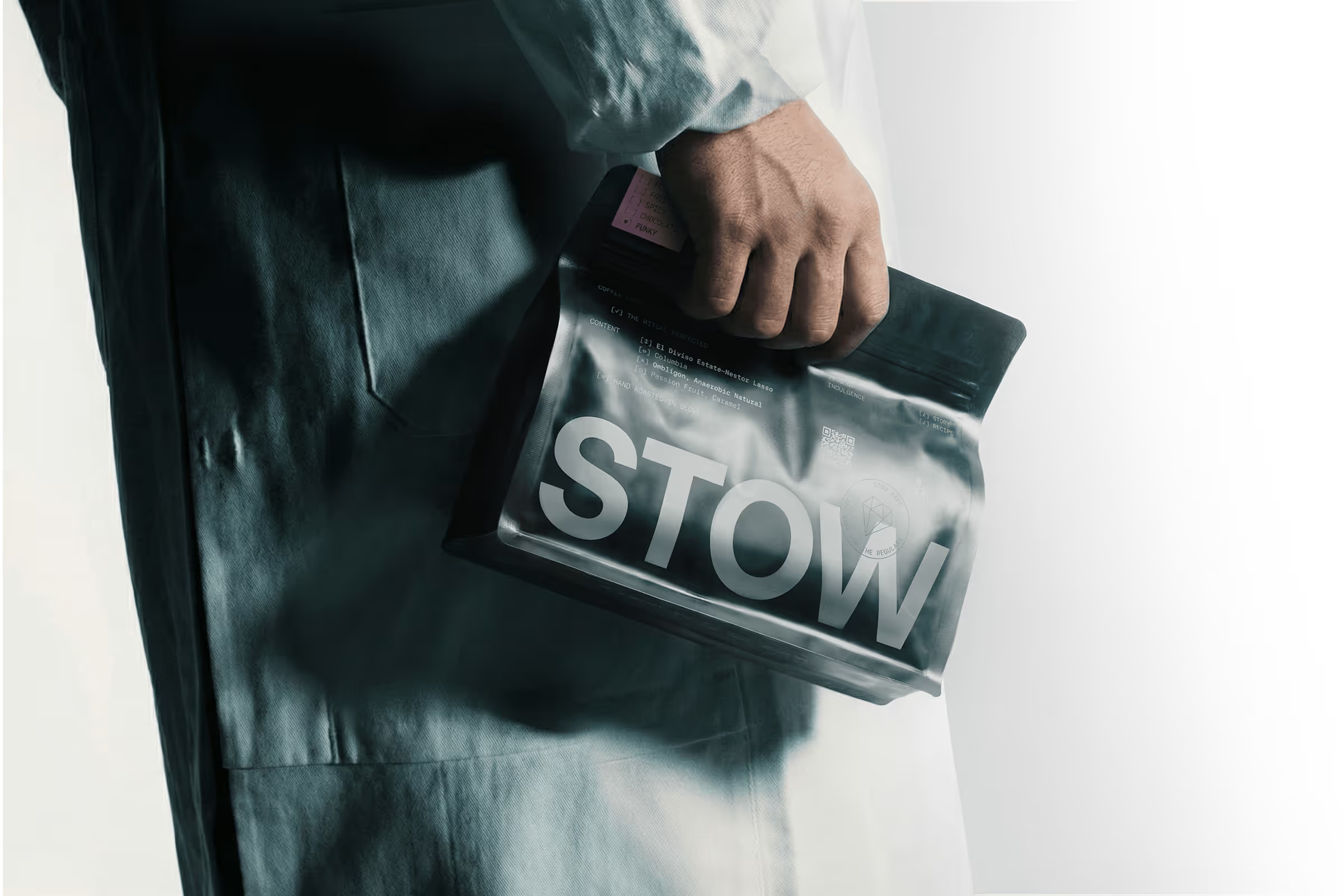
Slovenian coffee specialist STOW has a new visual identity by RAW LAB. The studio kept the existing logo and built a broader system around it, using monospaced type, technical graphics and layouts informed by laboratory records and roasting data.
The packaging makes that thinking tangible. Colour helps distinguish flavour profiles, while the monochrome framework carries through menus and retail materials. For STOW Rare, metallic finishes give the range its own expression.
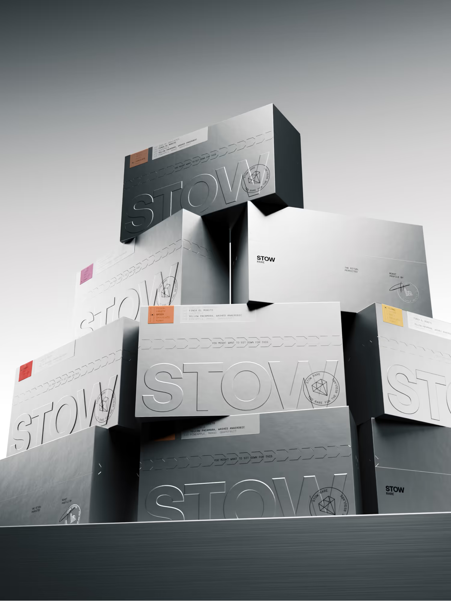
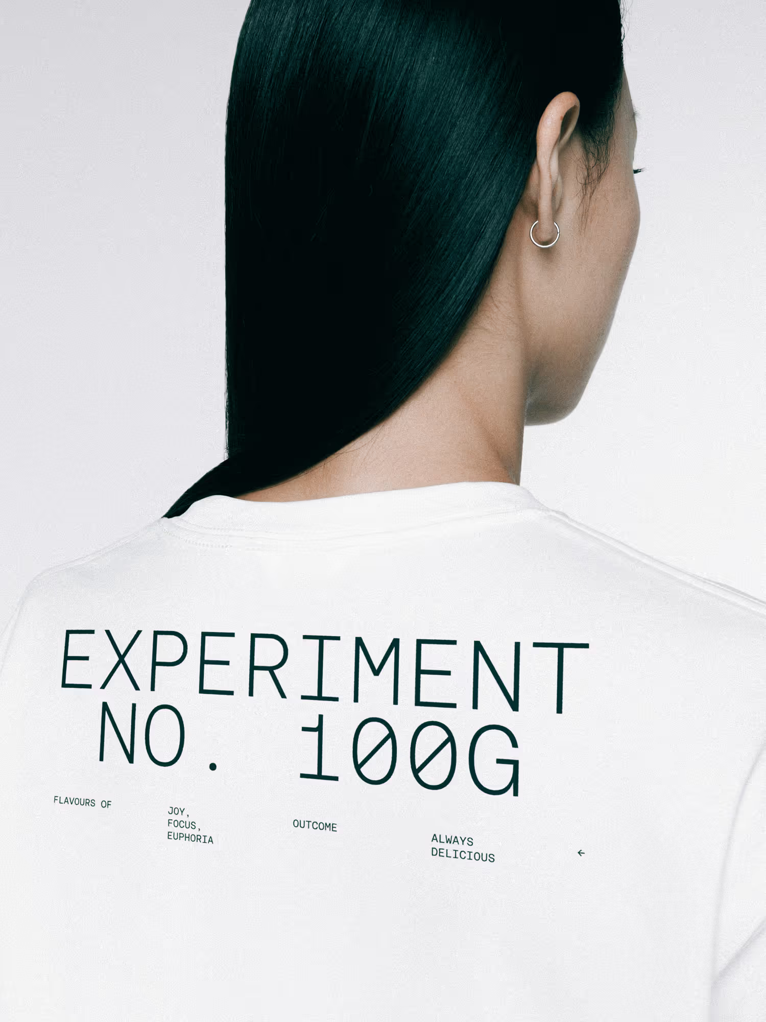
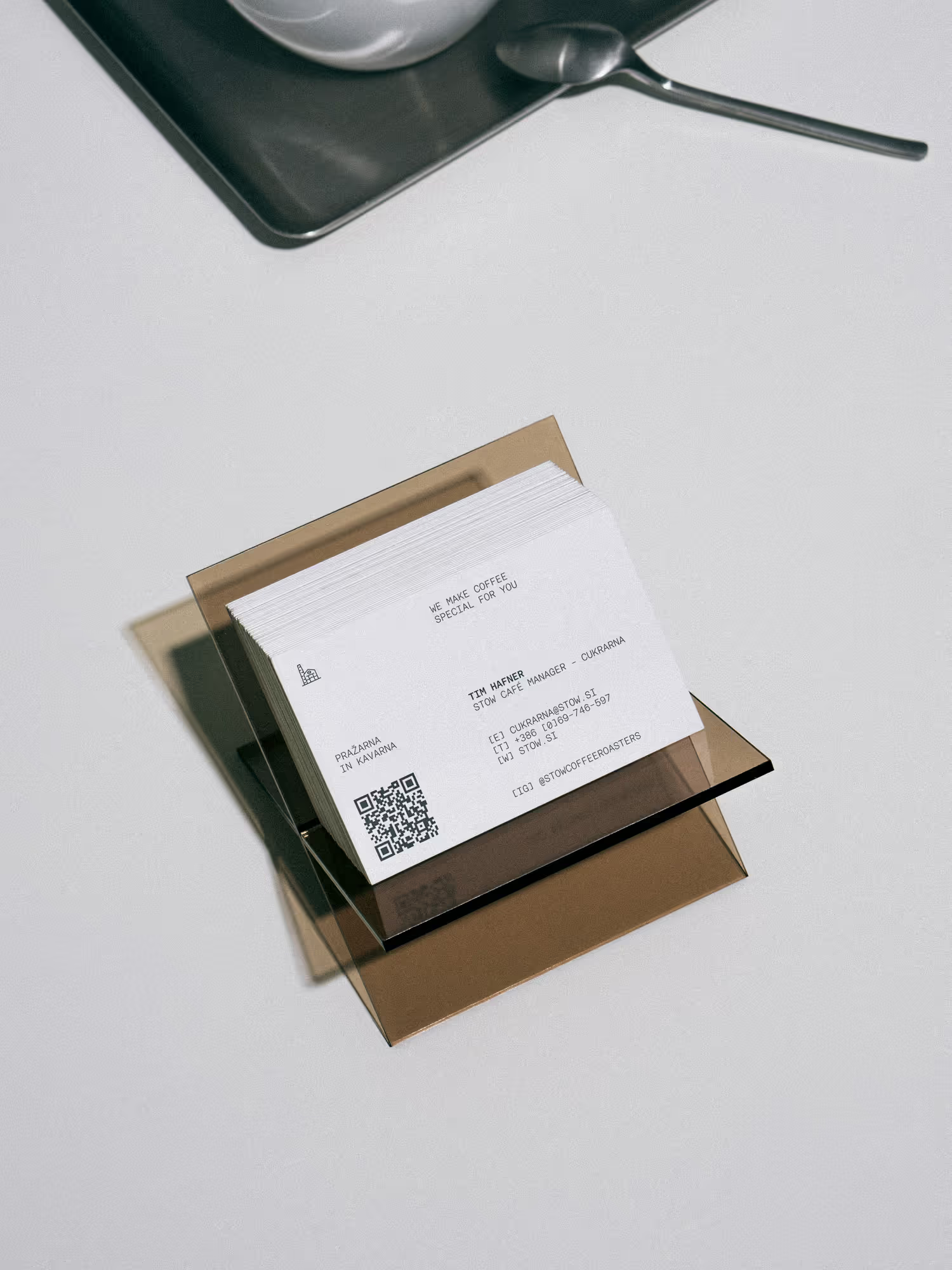
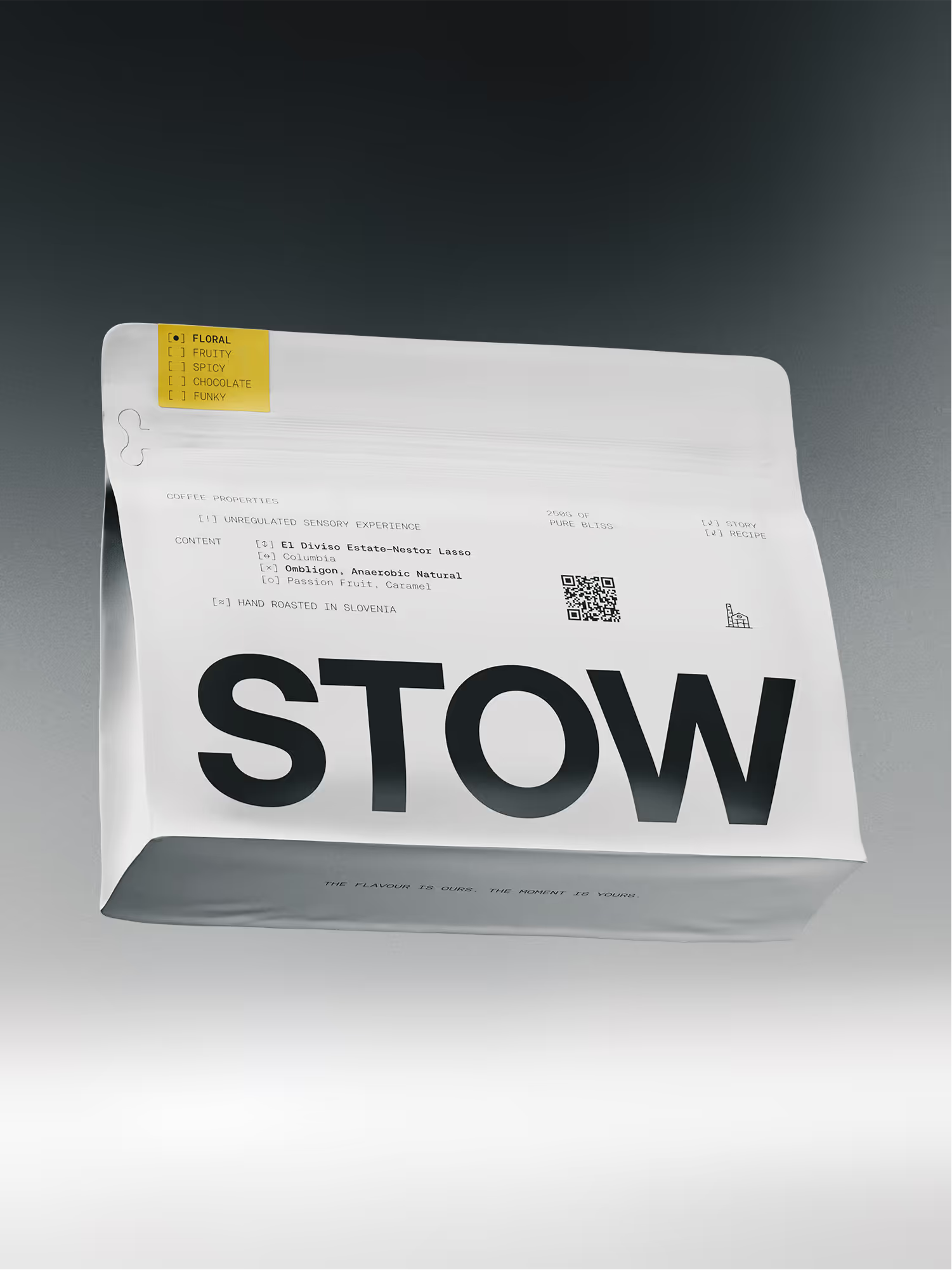
What caught our eye is the relationship between information and material. The technical details give the design structure; the packaging gives it presence. Together, they make the care behind the coffee visible.
Design and project imagery by RAW LAB. Featured on Visuelle.