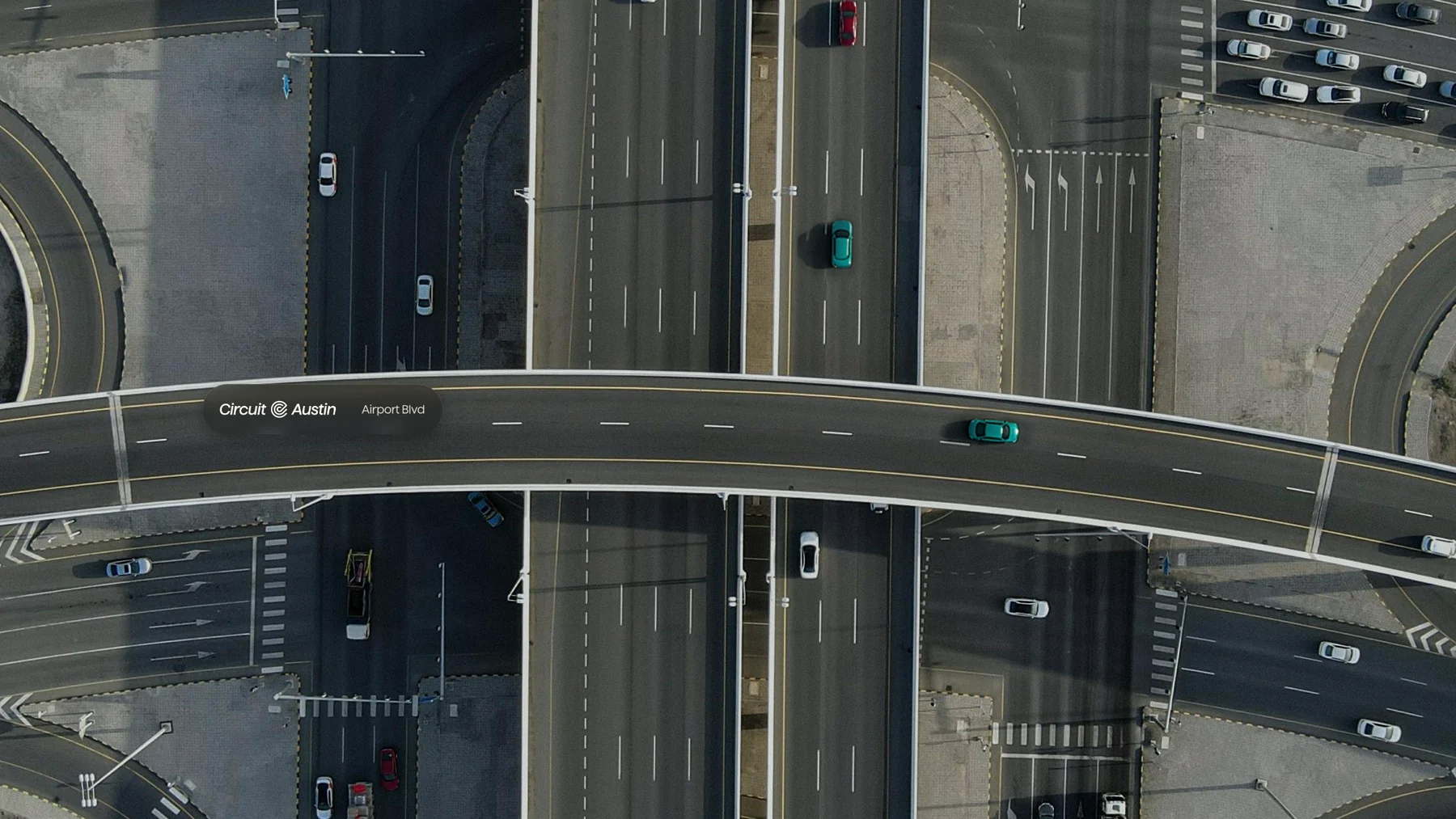
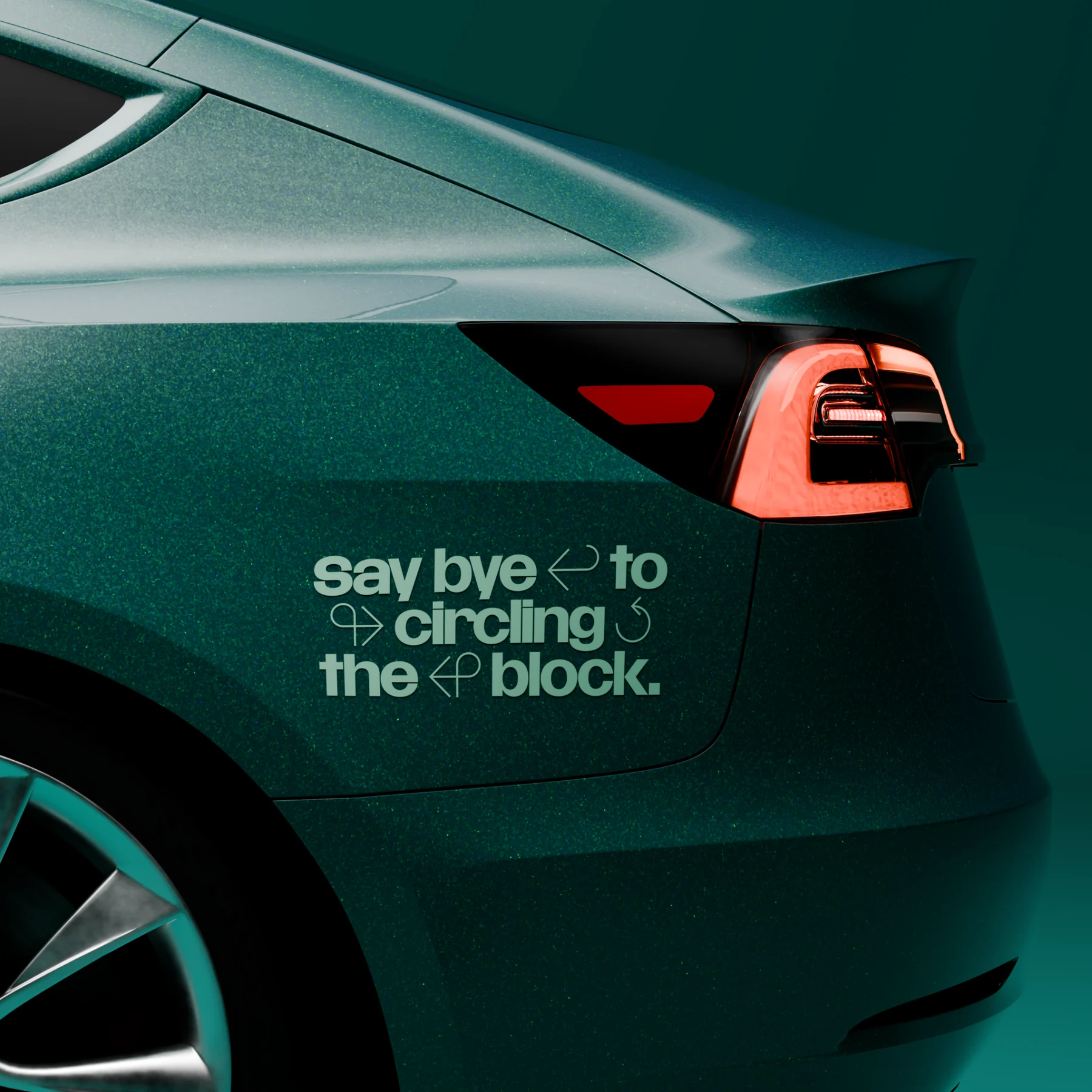
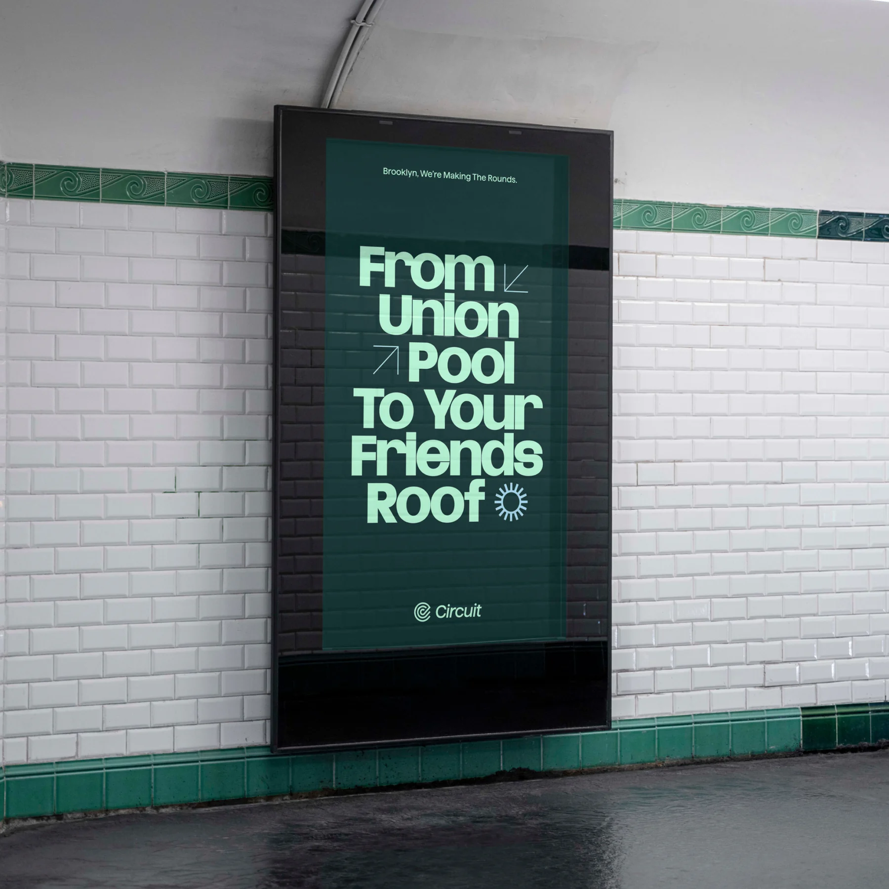
When a shuttle service operates in dozens of cities, the brand has to work on a vehicle, on a phone and at street level. Circuit’s new identity keeps its core elements consistent while letting each market use the place names and references its riders know.
The project’s strongest idea is to treat the brand like public wayfinding. A continuous route line and a set of directional shapes give layouts a sense of movement. A tool for generating new line patterns lets the in-house team keep making city-specific materials from the same system.
Visual identity and campaign visuals by The Collected Works.
All articles